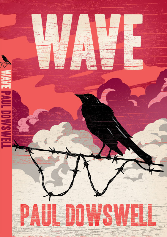
David Wardle has been working on several covers for Barrington Stoke recently, including this bold design for Wave by Paul Dowswell. Like many of Barrington Stoke's titles, the book has a dyslexia-friendly layout, typeface and paper stock for those who struggle with reading, however this is all neatly disguised behind a sophisticated cover which belies the reading age. More about how Barrington Stoke design and publish their books so they are inclusive of children with dyslexia can be found here.