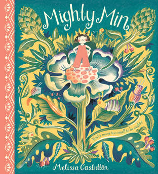
 | Want to know more about character, composition and colour? Read on to find out how illustrator Melissa Castrillón approached these key areas in her debut picture book, Mighty Min, which published this May with Alison Green Books. |
Character
Mighty Min is about a miniature girl who goes on a big adventure and finds out how brave she is. I knew I wanted Min to have a strong visual personality.
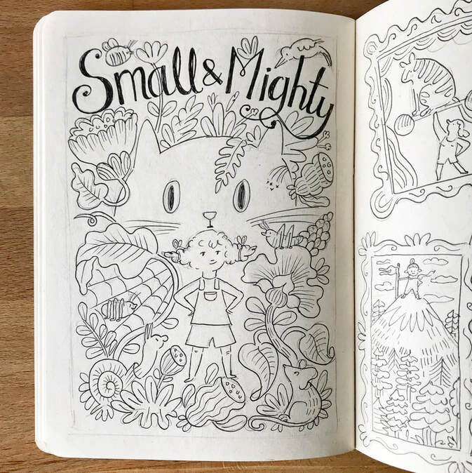
Originally the book was going to be called Small & Mighty and Min looked a lot different – more Pippi Longstocking with crazy, curly hair. But slowly through very rough sketches she evolved….
Originally the book was going to be called Small & Mighty and Min looked a lot different – more Pippi Longstocking with crazy, curly hair. But slowly through very rough sketches she evolved….
Character drawing isn’t my strong point so Min was looking a bit long and awkward to begin with. And because she spends a lot of the book running and being active I had to try and draw her in lots of different mighty poses.
Her hair evolved with her movements and it helped having those pigtails to emphasise her movements.
Her hair evolved with her movements and it helped having those pigtails to emphasise her movements.
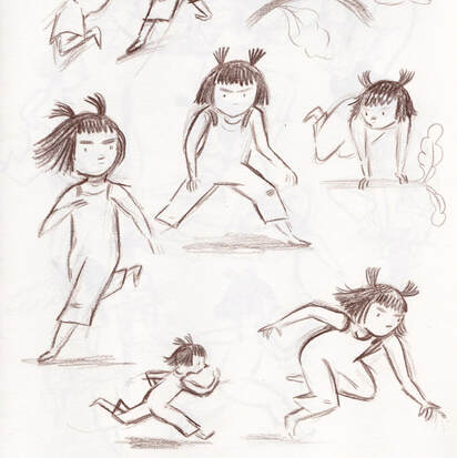 | 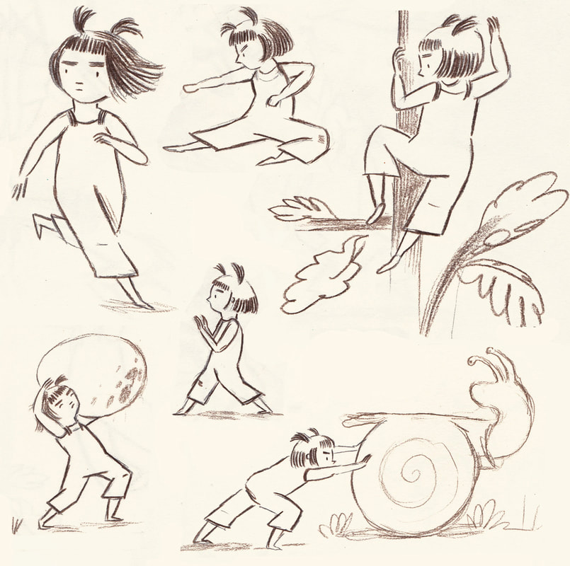 |
Finally I got to a point where Min was exactly how I envisaged her. And drawing her in different scenarios and putting her into context really helped to get her looking right. I’d recommend to anyone developing a character, to put them into their environment, it will help to bring out their personality.
Composition
Developing the compositions for my books is one of my favourite parts. I just love the interplay between text and image and how I can think of new, fun and inventive ways of designing the imagery in and around the text.
Two classic ways I do this are, NUMBER 1- Designing the imagery AROUND the text, like in this image.
Two classic ways I do this are, NUMBER 1- Designing the imagery AROUND the text, like in this image.
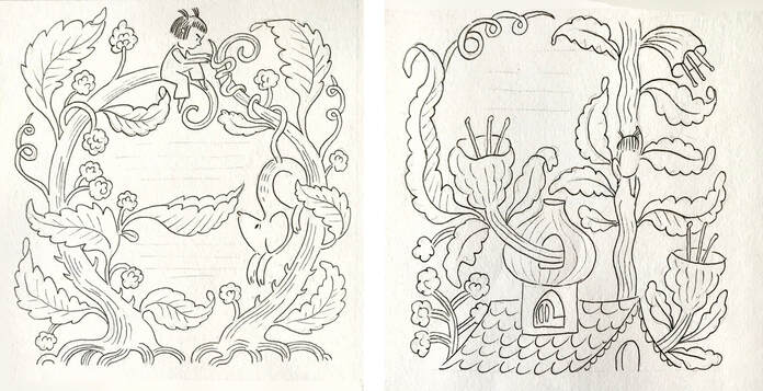
Only one of these images was used for the book but both were explorations to see how the imagery could encircle and intertwine around the text of the book.
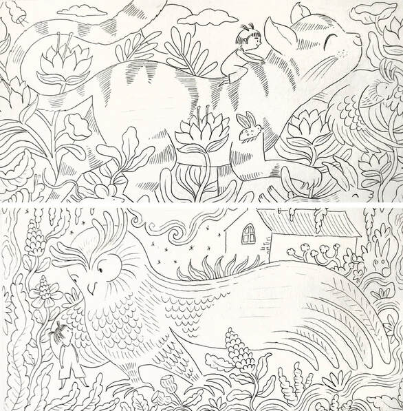
And NUMBER 2, is designing the imagery to hold the text with in it. This often works well when it’s within the negative space of an object, animal or thing. For these two spreads (both featured in the book) I designed the owl and cat to hold the text within the shape of their bodies. I love it when this technique of text and image intermingling works well.
And NUMBER 2, is designing the imagery to hold the text with in it. This often works well when it’s within the negative space of an object, animal or thing. For these two spreads (both featured in the book) I designed the owl and cat to hold the text within the shape of their bodies. I love it when this technique of text and image intermingling works well.
Below is an early storyboard for the book, lots of pages changed between this and the final. But you can see how I really design the imagery with total consideration to the text and how the compositions compliment and incorporate the placement of the text.
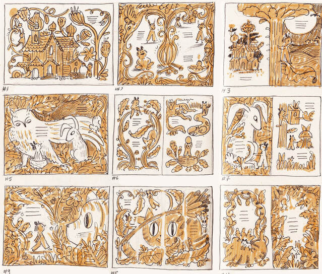
The fluidity of shapes really helps to do this, and having so much foliage in this book made the job a lot easier.
I LOVE a negative space, you can never get enough of them :)
Colour
The final colours for the book were vibrant peach, yellow, teal, purple and a black. I feel that the added purple and the peach instead of hot pink gave a warmer feel to the images.
So the next stage was to pick the exact Pantones for the book as my book was going to be printed in spot colour instead of CMYK.
So the next stage was to pick the exact Pantones for the book as my book was going to be printed in spot colour instead of CMYK.
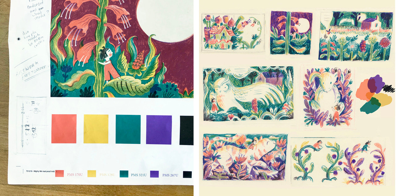
This means that instead of each page being printed from a full colour CMYK file, each page would be printed from 5 black layers (which I’ve drawn) and each black layer is one of the 5 pantone colours. For examplee below...
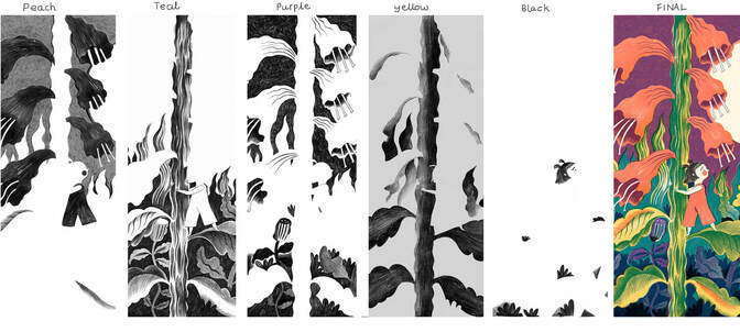
...this is the black art work in 5 layers and then the FINAL spot colour printed image. Spot colour allows the colours to be more vibrant when printed on paper and more control of how each colour will look, because it will be a Pantone colour you chose.
Mighty Min by Melissa Castrillón is available in all good bookshops, published by Alison Green Book HB £12.99, PB £6.99